Special edition transit cards are good, and transit agencies should go beyond the basics sometimes.
Special transit card designs have always been a pretty smart move - transit agencies should do more of them.
I can’t remember the first time I heard about special edition transit cards. Perhaps it was in a Geoff Marshall video, or in an article written about a massive transit system in East Asia, but ever since I first became familiar with the idea I’ve been a huge proponent of it. This week, I attended Fan Expo in Toronto (which was a stressful experience — I forgot how crazy such conventions can be!) and picked up the latest special edition transit cards here in Toronto, and so let’s talk about them and why I think doing a special edition card is so smart.
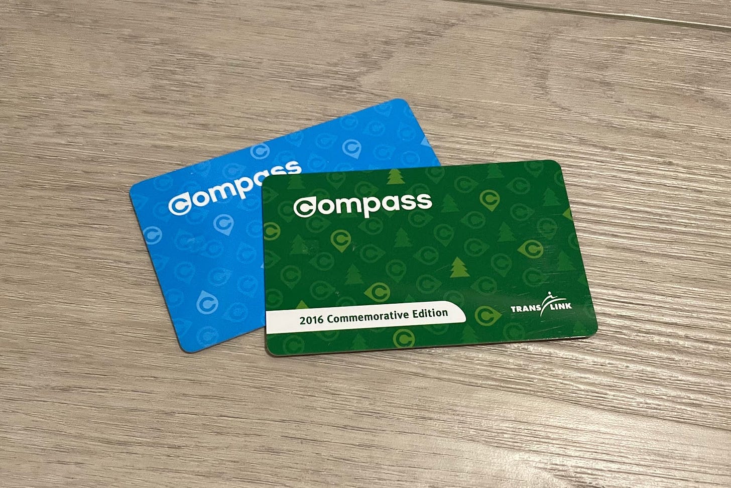
Special edition transit cards are a really smart thing that seem to be increasingly popular. The idea is to take the tried-and-true transit fare card design seen in various cities and incorporating a unique design or theme that pays homage to a certain event — often a transit project opening, a period of time, or some sort of partner. In the case of the picture seen above, the Compass card used in Metro Vancouver was re-themed in a nice green to celebrate the opening of the Evergreen extension of the SkyTrain network into Coquitlam.
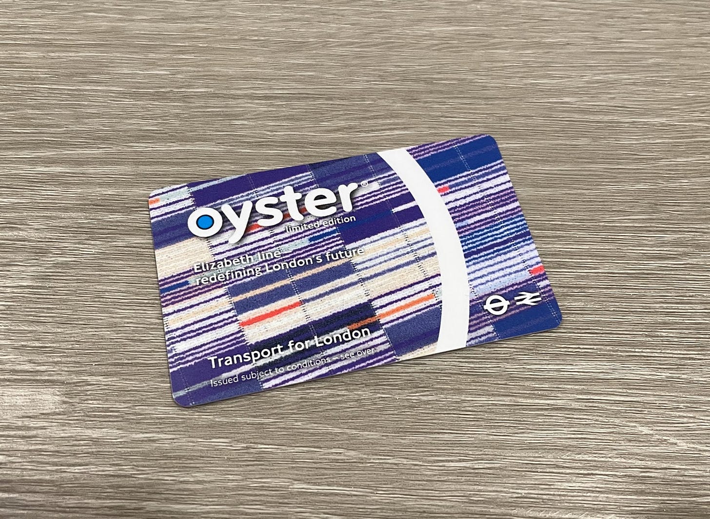
When the Elizabeth Line was opened a few months ago in London, something similar was done with a special edition Oyster Card commemorating the event.
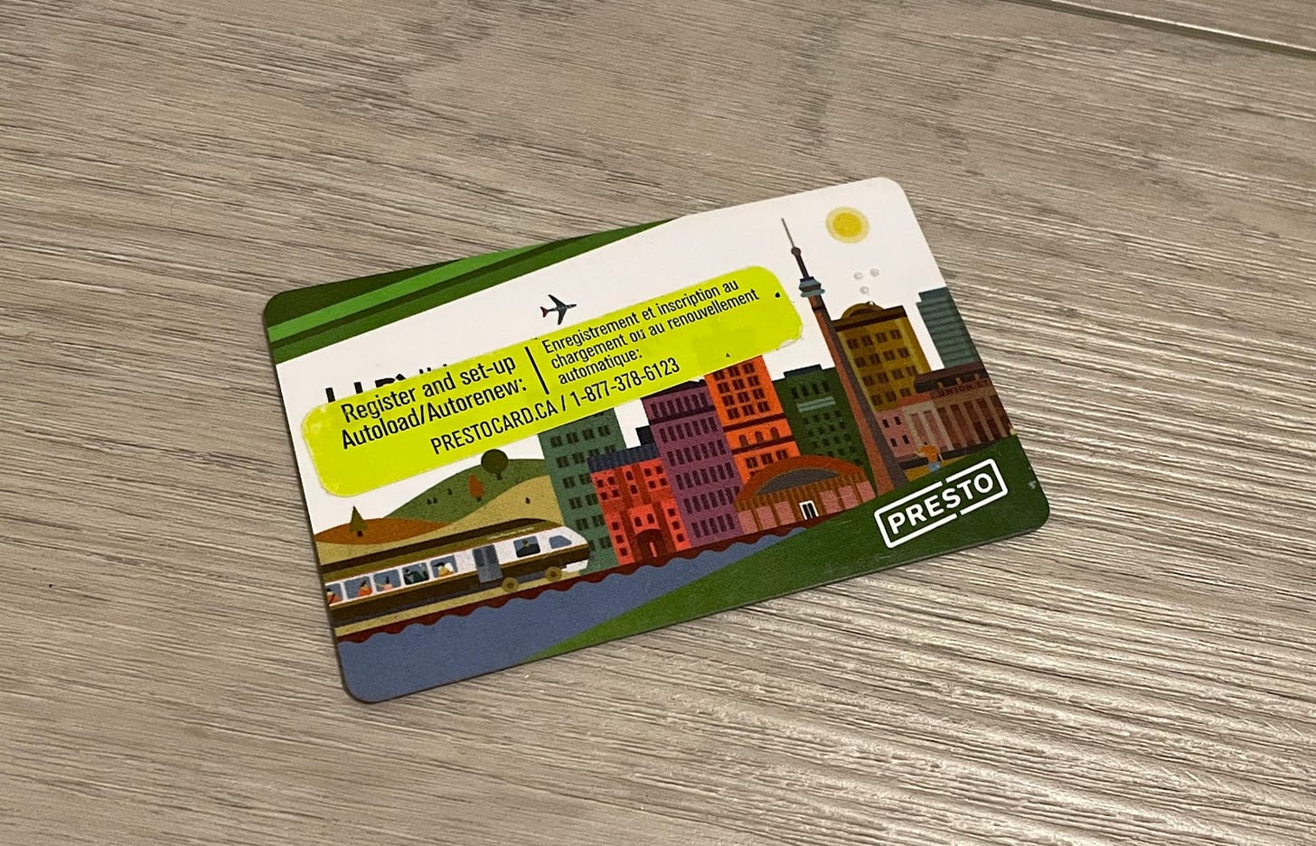
Toronto has even done something like this in the past with the launch of the UP Express in 2015 — which was particularly cool given the unique graphic was derived from a series that were created for marketing and informational materials for the service.
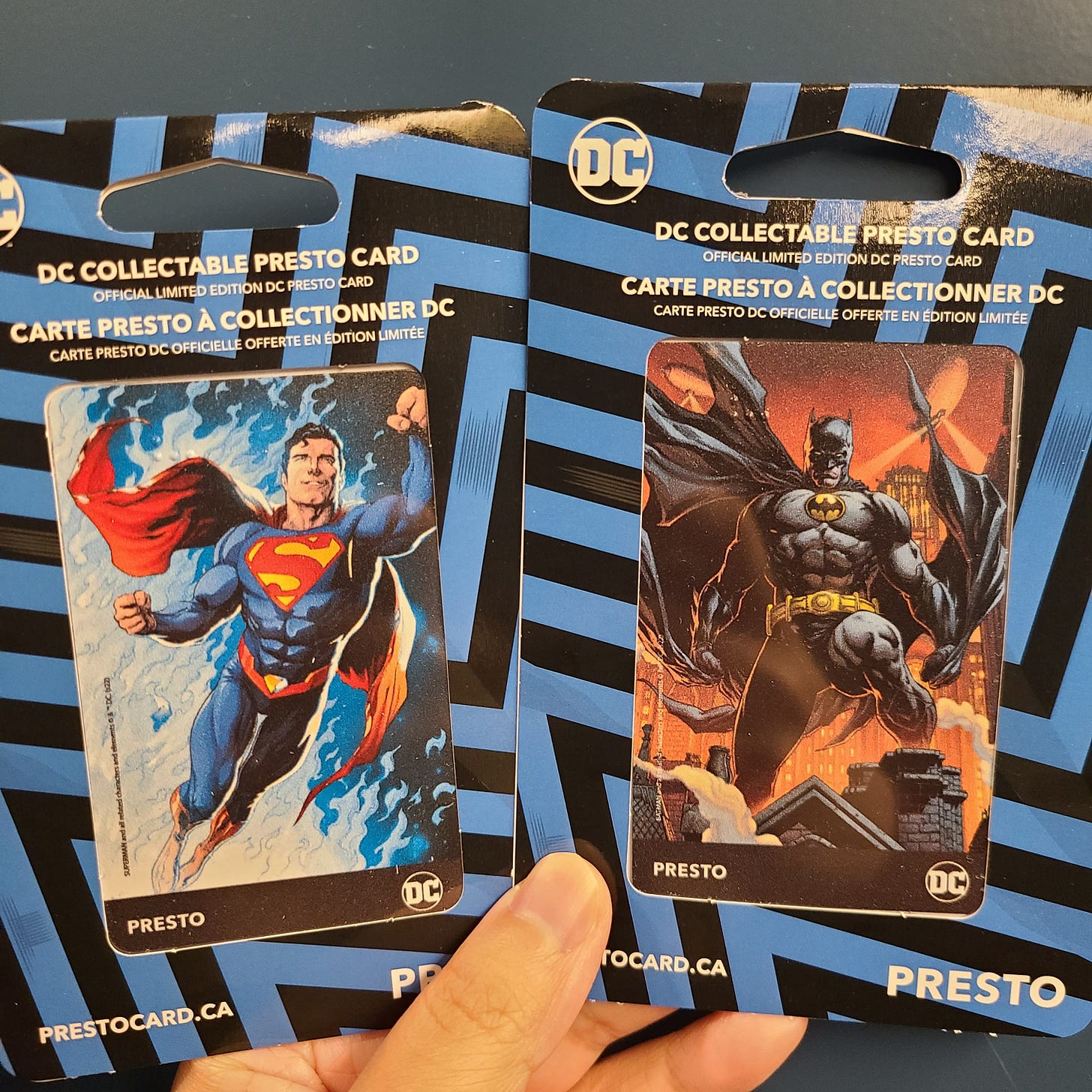
This new special edition card design or more accurately designs are something quite different. Unlike some of the other special edition transit cards I’ve mentioned, Metrolinx has actually done a brand partnership here, and they’ve actually done it before. A few years ago outwear maker Canada Goose (whose parkas and jackets are incredibly popular in Toronto) collaborated with Metrolinx to create a very rare special edition Presto card which came alongside a special Toronto edition jacket (Canada Goose is based in Toronto). This was quite a cool initiative, and if you bought the jacket you got a card; unfortunately that means those cards are very hard to come by, and so while it may have been a good branding exercise I think it missed some opportunities.
The new brand partnership Presto card Metrolinx is doing is very interesting indeed. This special edition Presto card is quite cool for a number of reasons: For one, unlike with the Canada Goose card, it is a fair bit more accessible as you did not need to buy a $1000+ jacket, and instead just needed to attend Fan Expo in Toronto (which to be fair is not free); and the cards themselves do cost $35 each, meaning if you want to buy all 5 unique designs you will probably need to spend over $200, but hey this is progress and one card is also fun! The actual designs are quite possibly the coolest part because Metrolinx was actually able to collaborate with Fan Expo and DC Comics (yes, that DC), so the designs feature iconic DC characters from Batman (x2), to Superman, to Wonder Woman — which is legitimately quite cool. The cards are also in a portrait format, which feels like the trend these days and was the original design of the green Presto card. From what I’ve heard, the partnership has also been some time in the making. What’s more is that unlike some previous special edition cards, these Presto cards actually have the design physically changed, whereas some previous designs were simply decals applied to the standard card.
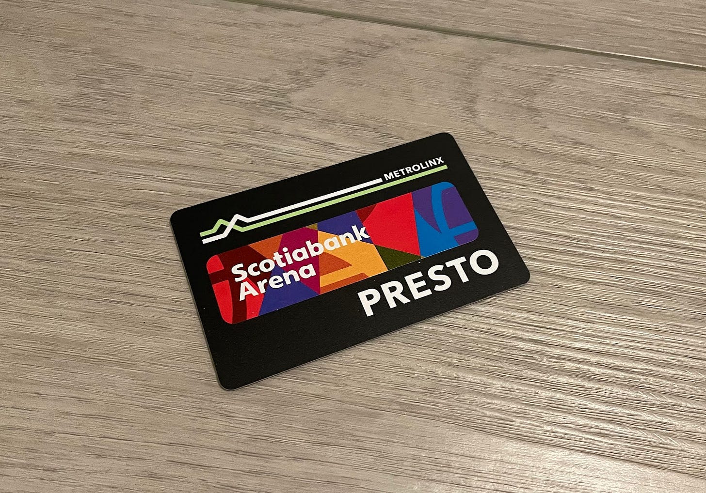
Now, you’re probably saying “this is neat Reece, but is doing this kind of collaboration actually helpful in any way beyond exciting comic book fans?” and to that I say “yes!”
For one, the idea of generating non-fare revenue in transit agencies is growing ever more popular, though it has been well used in systems like the London Underground for decades. Transit systems move a lot of people and touch a lot of people’s lives, and people will pay for things that might be seen as silly or superfluous at a macro scale. Taking design and infrastructure assets of a transit agency and allowing them to become part of interesting products, art initiatives, and more can help transit agencies as they get out of the lucrative 9-5 commuter market (to the extent that market ceases to exist) and get into being a more central day-to-day part of people’s lives.
For two, this type of brand partnerships or custom designs can create a very interesting association between the city and transportation system and various pop culture icons, brands, as well as cultural and historic events. This is positive for transit in that it helps people to view it as more of a part of the city and its culture, rather than simply a utility. Cold and lifeless systems are absolutely a worse experience than bright and friendly ones (like those so often seen in Japan). Of course being part of the city’s culture is also huge for normalizing transit use and non-car mobility. For the partner, the scale and recognition associated with a transit system is really powerful, especially in the sense that most people will be familiar with a transit system within a particular geography. Probably ultimately though, a card is a rare single small item that encapsulates the city and its mobility network
What’s especially cool in the case of the DC-Fan Expo-Metrolinx collaboration is that it is not a one way thing. That’s natural and you would expect a transit agency to correspond with organizers from a major event like an Expo, but what’s especially cool is that there is deeper integration in order to promote transit use. When buying tickets for Fan Expo, you can actually purchase GO tickets all in the same checkout flow, which is a really smart idea especially for visitors, and could be refined and made even better in the future. Perhaps all attendees could be provided a discount rate to encourage transit use!
Ultimately, I think collaborations like this are great and I hope to see more; in the Toronto case, I really want to see special edition cards for the opening of Lines 5 and 6!


