The nicest new railway station in North America is coming to Toronto, and nobody is talking about it: Exhibition Station
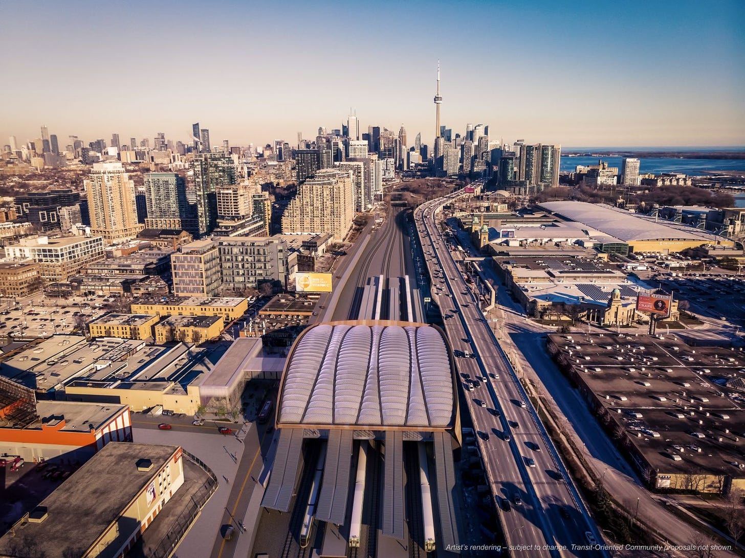
Exhibition Place is soon going to be home to one of the most impressive rail stations in the Americas.
If you enjoy this article, please consider sharing it with a friend, unfortunately some social media platforms are making sharing from Substack a real pain!
The Ontario line is a project that has been scrutinized a lot by media, and probably even more by the transit community. And given, this I think it’s shocking that more discussion has not happened around the massive rebuild plans for the station at Exhibition Place.
In this post, I’m going to talk about that conversation and do a run down of the stations design — as design documents were released by the city of Toronto (posted recently on the great UrbanToronto forum here) as part of the construction permitting process.
You see, the Ontario Line is not simply adding additional platforms to Exhibition so it can act as its western terminus of the new subway; Instead, it’s a complete rebuild of the station, a reconfiguration of its layout, and then adding new subway platforms that are fully integrated into the larger station complex from a design perspective.
Given the high cost of the SmartTrack stations, which are being procured around the same time and in similarly dense urban environments, I wouldn’t have been surprised if a comprehensive upgrade and expansion to add in the infrastructure for the Ontario Line cost the better part of a billion dollars. But the project that’s actually getting built is such a drastic transformation that I don’t believe it isn’t costing more than a billion all in, especially given the complex staging needed to build the structure directly next to the Gardiner Expressway and more importantly around the very active Lakeshore West rail line.
What’s getting built?
The Current Station
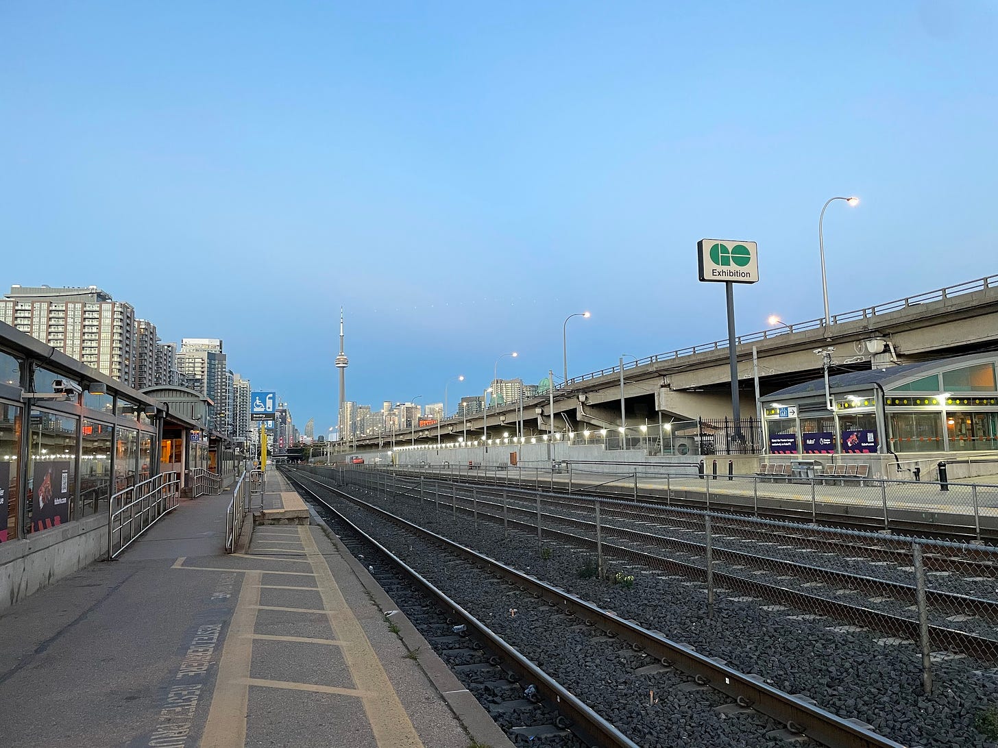
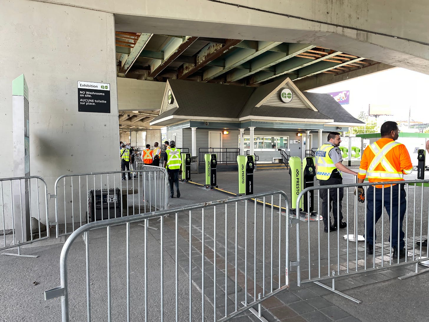
Currently, Exhibition station has four tracks with two side platforms servicing the outside tracks, with the usual bus shelter like buildings providing the only serious protection from the weather. There are centre-running express tracks that are not served by platforms. On the south side of the station is the large TTC streetcar loop serving the Bathurst and Harbourfront Streetcars as well as the Dufferin bus, while to the north are a number of other transit routes such as the Ossington bus and the King Streetcar. Travelling from one side of the station to the other to connect between the CNE and Liberty Village or the various transit routes requires passing through a single congested pedestrian tunnel which is frequently completely overcrowded, particularly during events as the nearby BMO field. I should mention there is an awkward old-timey ticket building sitting right under the Gardiner Expressway, which feels completely out of place.
The New Platform Layout
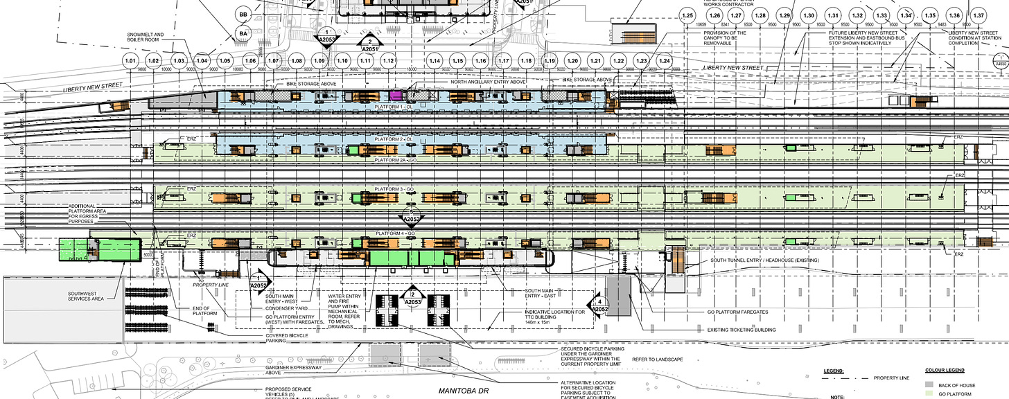
The plans to redesign the station drastically change its layout. While there will still be side platforms serving local trains, a new island will be constructed in between them to serve express trains as well, putting a platform on every track. The northernmost side platform will also be made to function as an island platform as one of the two side platforms added to serve the Ontario line will back onto it. This means the station will effectively have two side platforms and two island platforms.
Changes to Existing Access
Accessing the southernmost GO platform will still be possible from at grade level albeit after passing through fare gates, as per the station design all platforms will become fare paid zones.
While having fare gates at a GO station is novel, it’s something I’ve long supported; you don’t need to have them at every station, but for stations that do have them riders will have a clear reminder to tap on and off while entering or exiting the gates — if these are your largest stations then many journeys will encounter at least one gate. What’s interesting here is that the Ontario Line appears to be in the same fare paid zone as the various GO services, which raises some fare system questions (will tapping out be rolled out on the subway?). What’s interesting is that the decision to make this the first GO station with fare gates barely feels unprecedented as during events at the Exhibition GO has already been deploying a fare gate-like row of Presto readers.
The other GO platforms will also be accessible via the existing pedestrian tunnel, which will have staircases added from it to the eastern portion of the islands. Since there will be direct access to the platforms the pedestrian tunnel will no longer be for use by the general public. That raises the question, how are people meant to cross from the north to the south of the station without buying a ticket.
The Aerial Concourse
As it turns out, the answer to this is the most significant and dramatic feature of the station.
Right now, GO transit generally has two types of multi-platform stations. The vast majority of stations as with pre-upgrade Exhibition have fairly narrow pedestrian tunnels made out of precast concrete segments, while a couple of other stations have platforms accessed via elevated pedestrian bridges, such as Pickering and Rutherford (several stations have both). You could argue that Union Station is sort of the pedestrian tunnel option taken to its extreme with almost all access to platforms happening from underneath via concourses and teamways. This type of design works, but it has some majors issues. For one, you often do not have very high ceilings, and spaces often have a lot of columns to support the tracks and platforms above, making things feel claustrophobic.
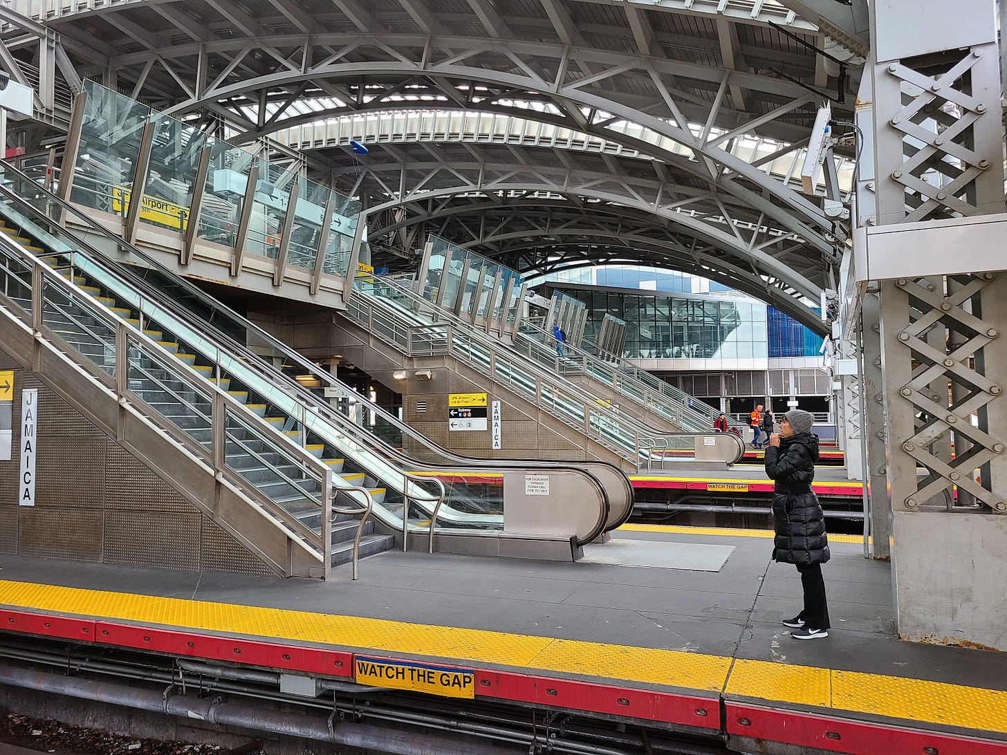
The alternative is something Reading Station near London or Southern Cross in Melbourne. In these stations the concourses and circulation areas are elevated above the platforms, which allows for lots of natural light in the concourse space, high ceilings, better sight-lines, and a more interesting roofline that isn’t just flat above the platforms but slope to enclose the concourse. This type of station is uncommon in North America but does exist — for example Jamaica in New York City.
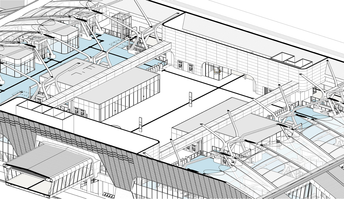
As you can probably imagine, the new Exhibition station will be this latter type, with a very large elevated concourse spanning the centre of the station. The south of this new space will run right up against the Gardiner with a big visual presence for anyone passing by. To access the space from the south, you’ll just go a little west of where you’d currently go to access the pedestrian tunnel, head inside, and ascend on escalators, or take the stairs or elevators.
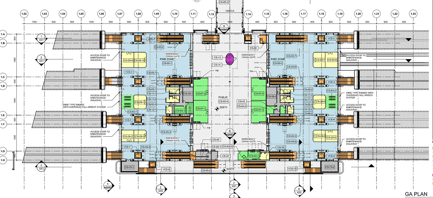
The main concourse level is quite impressive. It’s essentially divided in two with a wide open space in the centre that you can walk through to cross the facility outside of the fare paid zone (although not along the centre line as there will be a circular central help desk — which is a pretty good sign of this stations importance!). To your left and right centred in the station are large retail units which are very uncommon at GO stations but should be sustainable in such a high traffic location.
Flanking through a set of retail units on both sides to the west and east are four rows of fare gates. All over the walls of the concourse are fare machines, nicely integrated rather that sitting in front as opposed to taking up floor space. Heading through the fare gates the back of the retail “blocks” feature washrooms, which exist at all Toronto subway terminal stations. Within the fare paid zones on both sides are a number of additional retail units, and a small section of seating likely with views overlooking the tracks.
For each platform on each side of the tracks there will be stairs facing outwards, an elevator, and escalators that have been removed from most GO stations (supposedly to reduce maintenance). Having escalators at major rail stations certainly makes sense and being able to use them to cross the railway tracks will also be very nice. The way they are facing inwards may be to protect them from the elements and reduce maintenance.
All in all, the access is generous which is good to see, this station should be nicely future-proofed. The actual platforms have canopies that seamlessly flow over the stairs and then into the roof over the concourse, which is supported by some major angular braces for a very memorable design, at least compared to other stations in Canada; The small portion of the platforms that are not covered by integrated canopies have large enclosed waiting rooms.
I should also mention that access to the Ontario Line platforms will not be particularly different from access to the GO platforms; as the entire building is enclosed, the subway platforms are “indoors” with platform screen doors while the GO platforms are exposed to the elements. As with the other Ontario Line terminal at Science Centre, one platform will handle all arriving passengers with the other handling outbound trains and passengers, an operation decision that should maximize frequency.
Accessing the main concourse area from the north side is slightly different than from the south because a new street for now called “Liberty New Street” will be built along the south end of Liberty Village directly north of the station. Because of this, on the north side of the concourse is a wide pedestrian bridge spanning the street which links into a north satellite building with elevators, stairs and escalators.
This building will have a small plaza in front of it with a bus stop and bikeshare stations. Better yet, the adjacent properties are meant to have transit-oriented community developments, which can be directly connected to the top level of the satellite building, allowing residents to descend just one escalator from the lobby level of their buildings to access GO and subway trains.
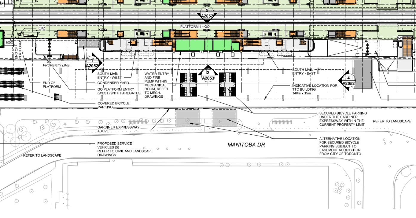
Hopping back to bikes for a brief moment, there will be a large under canopy bike area to the north of the station, and a large “paddock” style parking area to the south of the Gardiner as well as two secure bike rooms. It’s really great to see these spaces, which are probably the most significant bike parking provision of any transit station in Canada so far!
What’s the impact?
What I perhaps find most fascinating about this whole situation is that without a doubt the nicest mainline rail station in Canada is going to be built as a small part of the Ontario Line. It’s part of why I like the project — while the Eglinton Crosstown added “new” and enhanced regional train stations where the lines intersected, the Ontario Line appears to be conceiving those projects in a much more coherent way. The upgraded Exhibition is a good station in its own right, not just platforms hanging off a rapid transit station with a pedestrian tunnel and better canopies.
And I think that’s generally the rub: this station would be a very exciting project even if a subway was not included in it, from the dramatic design, to the excellent weather protection, retail units, fare gates, and loads of bike parking. In many ways it feels like the only station in the region that might be a destination in-and-of-itself besides Union, something which Toronto should have far more of as it builds a rail station that centres the historic terminal less.
Of course, the nice bit is that there will be far more than just GO trains at this station, you’ll have Ontario Line trains every few minutes and possibly through running streetcars (headed to King West and the western waterfront) in the future, making this possibly the most interesting place to sit and watch trains and trams go by in the country (a sense of animation that is underrated even for those who don’t like trains in and of themselves). The TOC developments that bring residences and more activity right to the station site will also be awesome, as right now the station feels like a couple of curbs down at the desolate end of Atlantic avenue.
I’m also happy to see that the station breaks from GO transit tradition by featuring so many escalators as well as faregates, it’s our first real glimpse of a station where GO is treated as rapid transit and not as commuter rail and it feels like a very strong start!
I also really think this huge station is a great way to start off a symbiotic growth streak for the CNE / Ontario Place / and the station itself. BMO Field is being expanded for the 2026 World Cup, and so it will only be releasing more and more riders into the transit station, however we need more. Right now most of the CNE site is taken up by parking lots and convention space which is often dead. Redeveloping this space into things like museums, amusement / leisure space and the like would be a great way of better utilizing all the space, especially as the transit capacity will be enormous. I think something like Marina Bay in Singapore is absolutely a good model, and that means incorporating more stuff to do at the Exhibition beyond just Exhibition and leisure activities.
Retail and restaurants should also exist to bring people to the site even late into the night and when larger events are not happening. Better pedestrian connections would also be much appreciated to make walking around easier, safer, and more comfortable and again taking inspiration from Marina Bay, grand green spaces would be awesome. All in all, I hope to see the whole area grow into more of a 24/7/365 destination for the whole region, keeping the station busy and justifying even more transit in the future.
The new Exhibition also clearly sets the standard for the future for large satellite stations, such as Bloor-Dundas West and East Harbour. These stations should have landmark buildings, faregates, lots of elevators and escalators, lots of bike parking, waiting areas for passengers, seamless transfers to rapid transit, retail within the station facilities, and on site connected transit-oriented development. It’s actually quite interesting to consider what a station like Bloor-Dundas West might look like if it embraced these design features. Consider subscribing as I think I will write an article soon on this!
A final note I want to make is about the reality versus the renders. What’s pretty cool is that despite the usual concerns that the early renderings for the Ontario Line (including the image at the very top of this article) would likely be embellished a lot and get cut down when final work happens, it really appears that the renders were pretty accurate, as you can see looking at the drawings for Exhibition. A world where renders are more honest about reality is another great thing about this whole situation!




GO Toronto!
I've seen the 2019 plans. However, they should at least put dotted line to indicate the future Waterfront West LRT would continue from the Exhibition Loop westward. If they haven't decided, at least show the options as "future" to be decided by someone in a different timeline universe.