Another Very Good North American Railway Station: East Harbour
East Harbour Toronto's massive new transit oriented development finally has a detailed station plan.
Hey there! If you’re reading this but haven’t subscribed, please consider doing so! Most articles are sent out to free subscribers and it helps me grow my audience, thank you!
Also, if you enjoy this article, please share it as widely as possible, Twitter appears to be quietly continuing to bury posts that link to Substack and it remains my main way of sharing these articles!
Toronto’s Ontario Line is a very exciting project that I’ve covered in tons of videos on my YouTube channel.
The project is the Toronto Equivalent of the Victoria line — a fairly short new-build metro line that will connect a ton of major stations and subway interchanges with an extremely high frequency service. The project will have just 15 stations, and far less new stations because so many of them are interchanges. A big part of what’s exciting is that it feels like Toronto — and by extension North America — turning over a leaf and starting to build subways that would be at home in Paris or Singapore.
The last major proper subway extension in Toronto took Line 1 from Downsview station to York University, and while it is fairly nice, the line is suburban, the stations are kind of questionable in their functional design, and everything is underground.
By comparison, the Ontario Line will have significant above ground portions running next to mainline trains and crossing a huge valley on a giant, brand new bridge. The project will also have more of a coherent cross-line design language, as well as station and facility designs that are world class with tons of passenger flow, not to mention platform screen doors! The project is simply a step change in metro design for North America that aligns with the world’s best projects instead of feeling like an unending rehashing of 90s designs like most projects on the continent — and it should look nice, because it is extremely expensive.
Part of the reason the Ontario Line seems to be so expensive is that a lot of elements of it (particularly in the southern sections) bleed into other transit projects — including the subject of today’s post: East Harbour Station.
I did a post in the summer breaking down what I called the “nicest” railway station in North America, which is the new Exhibition Station on the west side of downtown Toronto, where the Ontario Line intersects with the Lakeshore West GO line — historically Toronto’s busiest regional rail line with its connections to Port Credit, Oakville, Burlington, and Hamilton. And as a follow-up to that, we now have detailed designs for Exhibition’s sister station on the east side of downtown Toronto — East Harbour (thanks to Twitter user WB62 who posted them here). In this article, I’m going to look at the designs in detail and give my thoughts!
If you’ve not seen the previous article on Exhibition, I recommend reading it first.
What’s getting built?
The Current Station
Right now, there is no station at East Harbour, which makes some sense as the site was previously industrial and not really surrounded by all that much. Unlike at Exhibition where the new station is a rebuild of an existing one, East Harbour is completely new — although it should be noted that it is being fit around the existing rail alignment in the area, which means the station will have a gentle curve. While curved stations are never ideal, the curve here is gentle enough that it should be pretty cool, sort of like London Bridge or Berlin Main Station’s upper level.
Now, the fact that the station is brand new makes the fact that the design feels kind of bland more stark — because Exhibition is getting a dramatic design and it has to be constructed around an existing in use station.
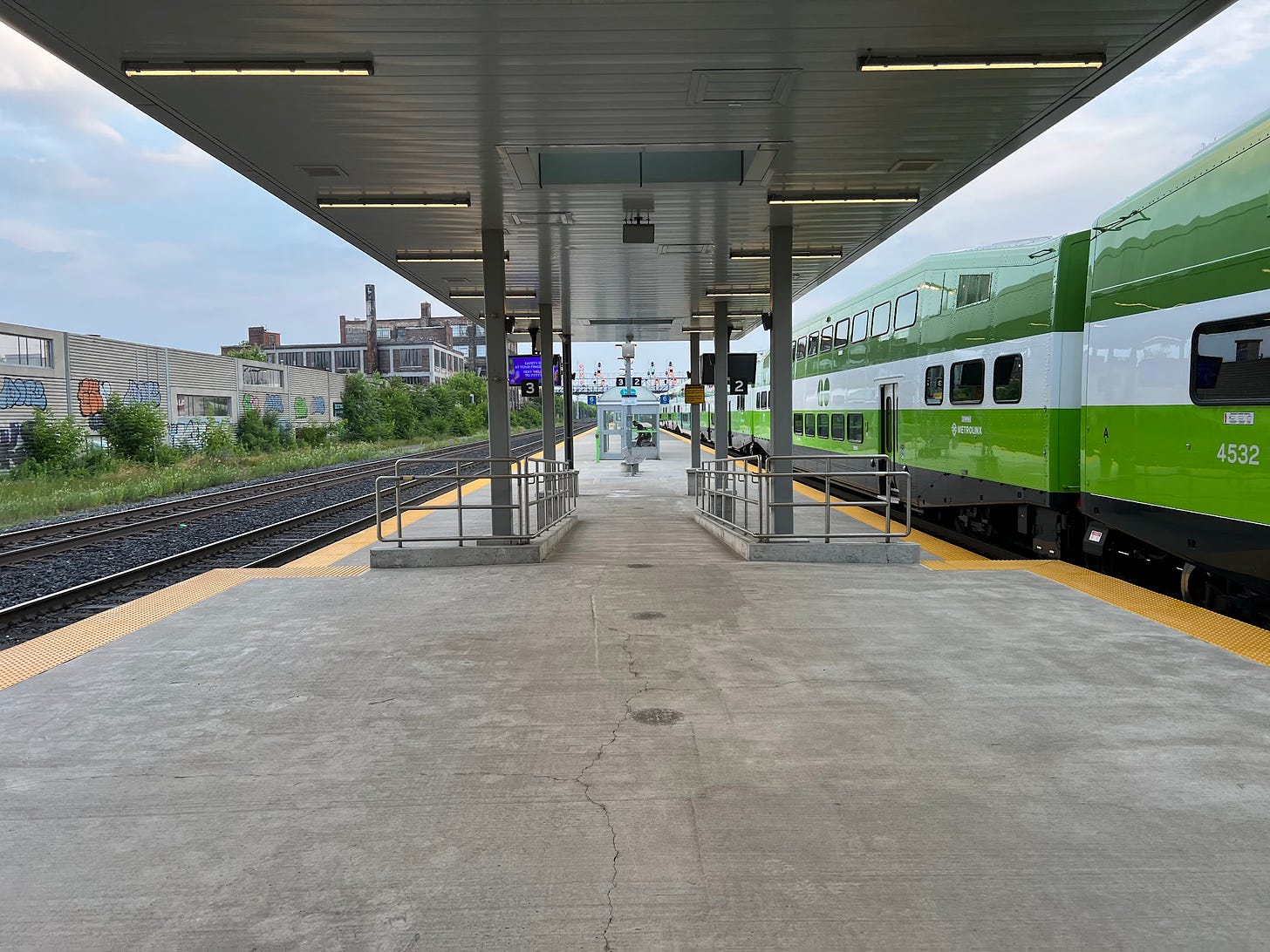
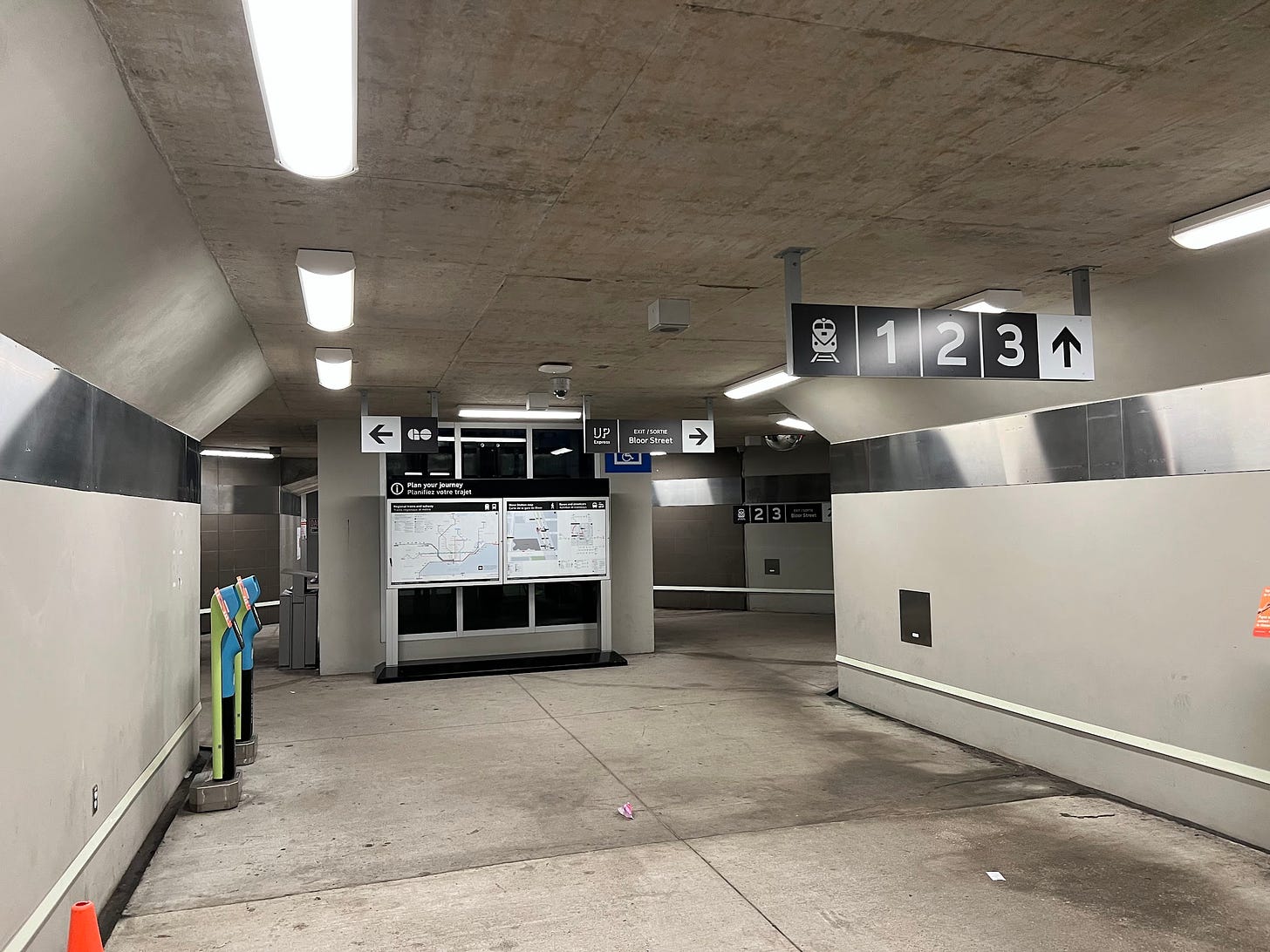
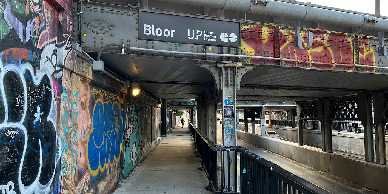
That being said, people’s complaints about the bland design do feel a bit hyperbolic, and a lot of them seem to miss the point that this will be a much better train station for passengers than even relatively recent ones like Bloor station (the other quad-track “gateway” station in Toronto besides East Harbour and Exhibition), which had narrower platforms and didn’t even have a full canopy!
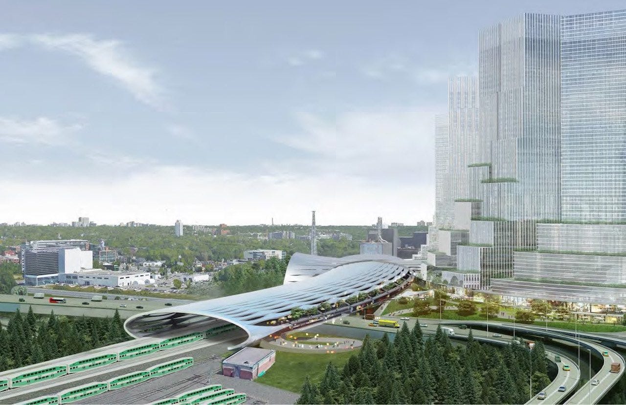
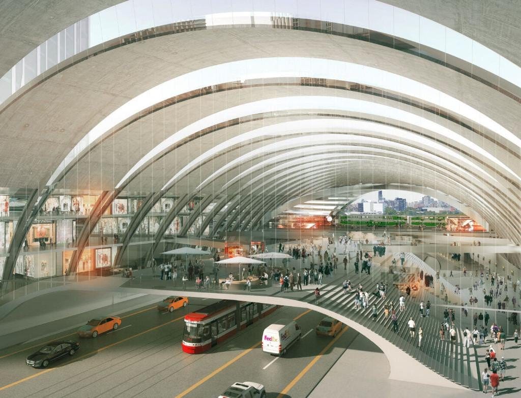
To some extent, this is probably because there were a lot of wild (and very attractive) renderings (by the developers of the East Harbour site I think?) of what a station could look like, which included designs with Zaha Hadid-esque floating curved concrete bridges and a giant tube enclosing the station that probably doesn’t make a lot of sense while we still have soot-belching diesel trains.
If you’re wondering why the design didn’t land quite in the middle of what the renders look like and what we got, my best guess would be 1) the Ontario line is costing a lot, and another billion-dollar Exhibition station that is nice but probably not necessary likely wasn’t in the cards, and 2) Exhibition already has a ton of ridership during the CNE, concerts, gamedays, as well as just… all the time. Every time I go to Exhibition it’s rather busy, and that’s probably because the high density skyscraper forest of Liberty Village is right there. Building a similarly lavish station at East Harbour when it seems like development is probably going to be slowing down because of high interest rates seems like a good way to have people talking about the station as a white elephant — it can always be expanded later!
At the end of the day, if your expectation was an impressive train station that would look at home in Japan, Italy, or Spain, then yes you will be disappointed; if your expectation was a typical North American train station as it was for me, you’ll be over the moon!
Platform Layout
The platform layout at East Harbour is simpler when compared to Exhibition, which if you’re recall had two centre island platforms and two side platforms — one for the Ontario Line and one for GO. This is in part because the Ontario line has side platforms at its terminal stations to help with providing high frequencies.
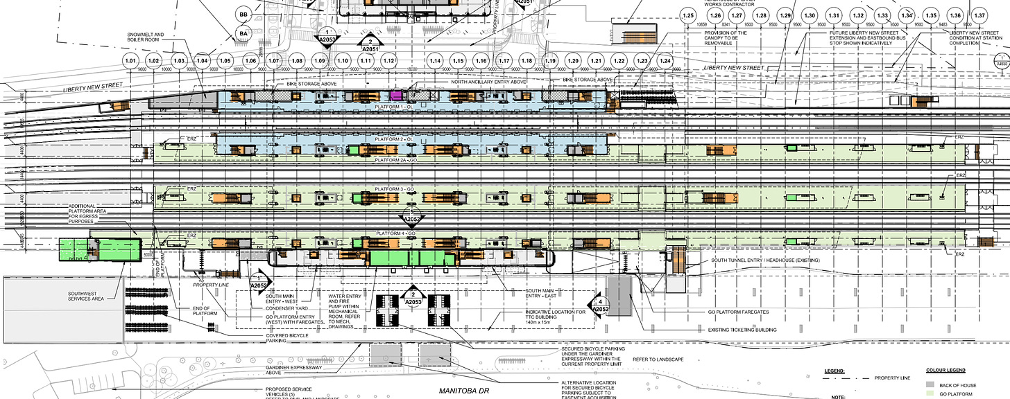
By comparison, East Harbour does not really place the GO and Ontario line stations in the same structure — which probably makes the station more affordable and is preferable to the different parties responsible for the subway and the GO trains (Ontario Line is being constructed and operated by a private consortium, and GO will likely be managed by ONExpress long term — DB, Alstom etc.). You can actually see in the architectural drawing that the short length of the Ontario line platform relative to the GO ones and the variable gap between them also allows it to perfectly straight, which is probably preferable.
You can also see that relative to the mostly consistent widths of the platforms at Exhibition station, at East Harbour there is a fairly substantial taper at the far western and eastern ends.
Access
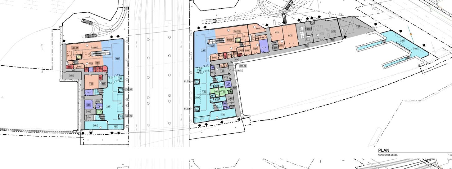
Unlike at Exhibition at East Harbour the GO tracks are above grade on a berm, and so instead of having an overhead concourse East Harbour is served by a ground-level one, or more accurately two. The term “concourse” is pretty important here, because this is another place where you see a significant improvement over a station like Bloor — which has typical precast GO transit pedestrian tunnels.
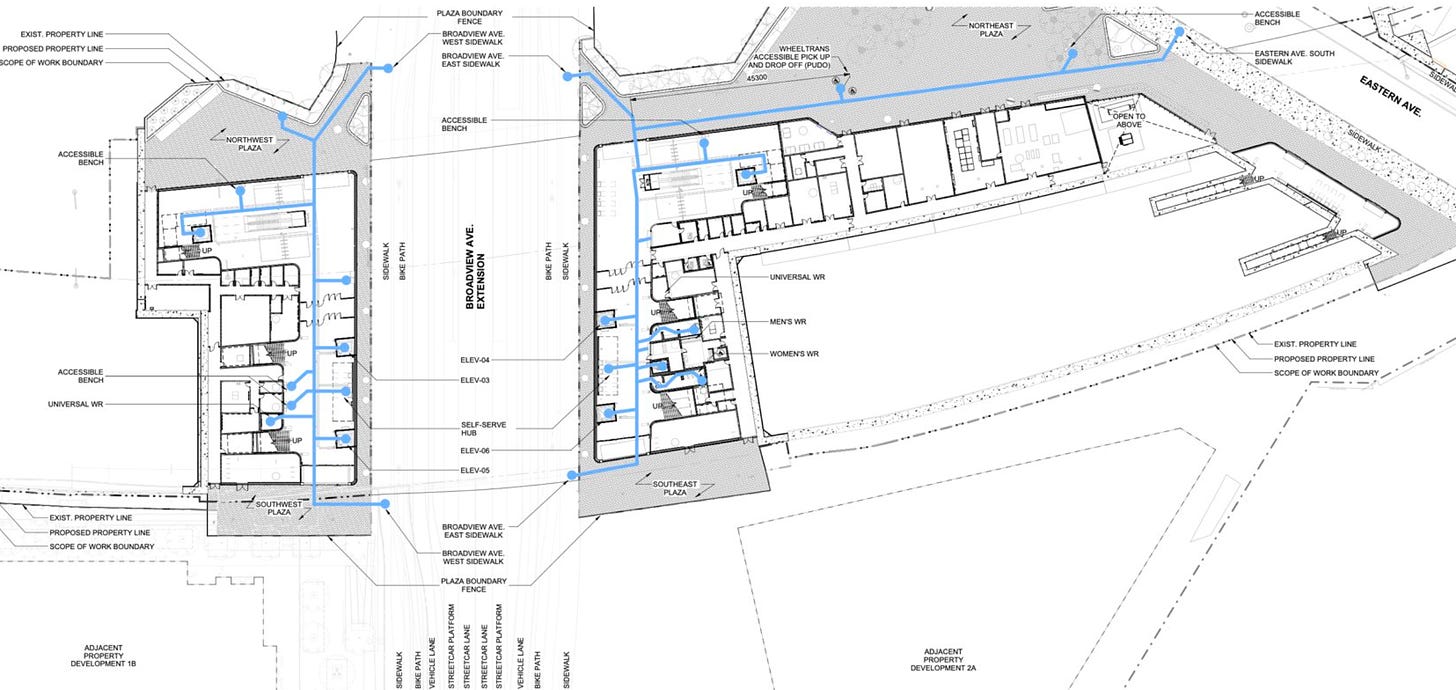
By comparison, East Harbour has sidewalks adjacent to Broadview Avenue (which will bisect the station passing underneath) as well as fairly large interior spaces under the tracks that lead to double-width staircases up to each GO platform on each side of Broadview. This should mean much better pedestrian flow, and it really does make Bloor feel completely undersized — especially since it’s getting a better subway connection itself very soon.
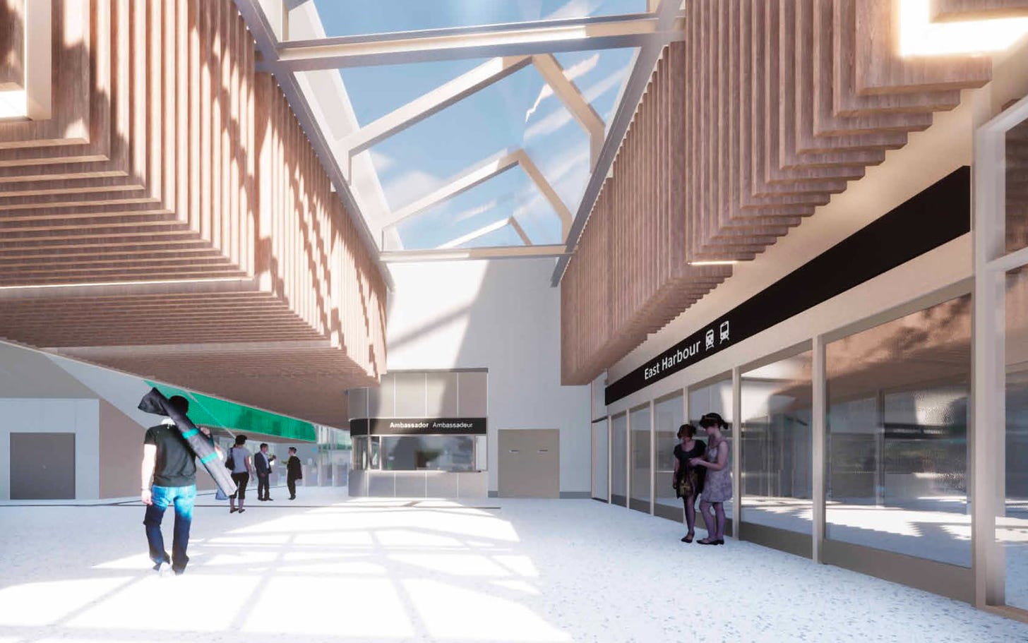
The other nice thing about the design of the platforms and concourse at East Harbour is that there are two elevators per platform (one on each side of Broadview) ,and the spaces are all indoors, which should be nice when it’s particularly hot or cold out.
The connection to the Ontario Line is at the north end of each concourse where there is a lot of additional circulation space, an additional elevator on both sides, and two escalators on both the east and west side of the station.
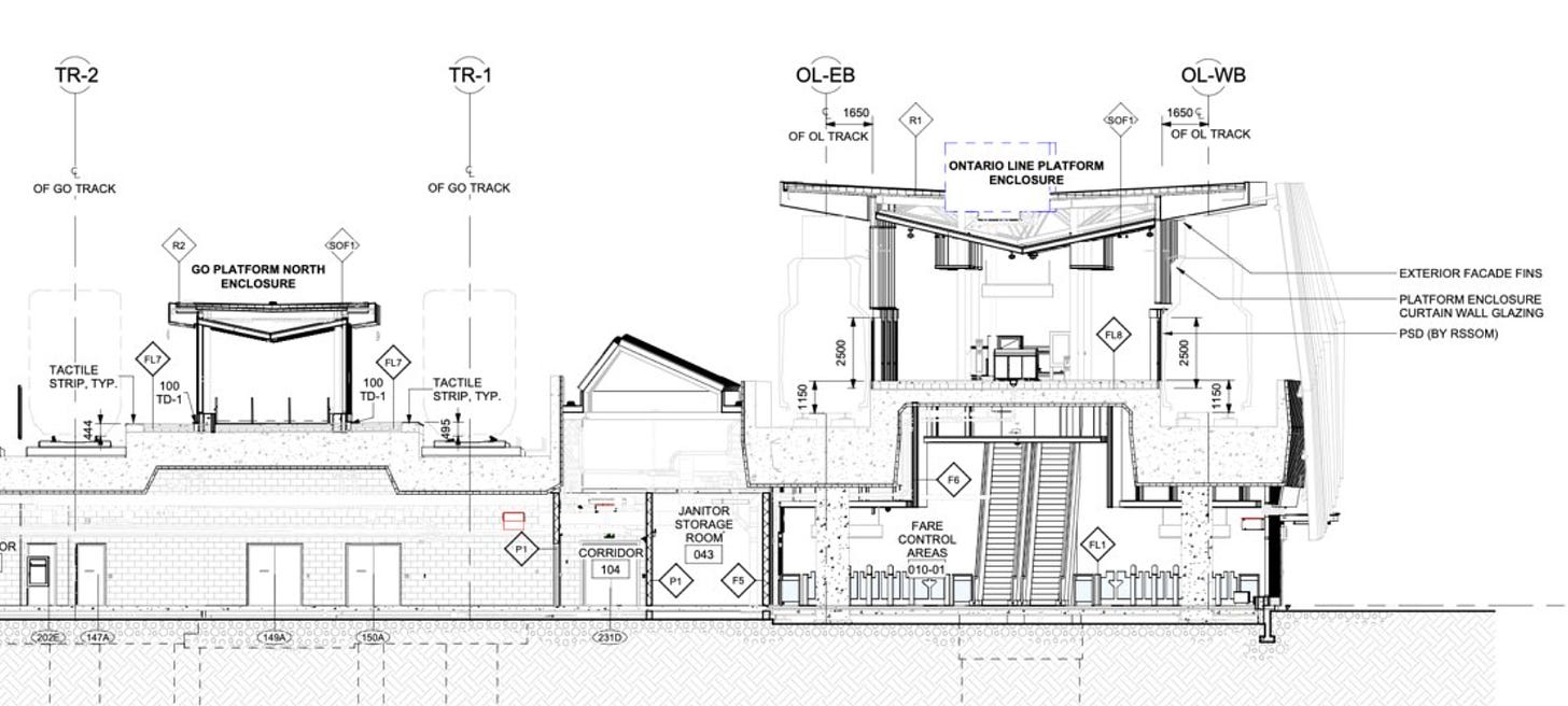
An interesting thing to note here is that when compared to the designs for Exhibition (which, to be fair, could have changed), in these drawings the Ontario Line and GO are in separate fare paid areas (fare gates at the bottom of the escalators to the sides), and there aren’t escalators up to the GO platforms — which is a shame. The Transit Costs people would probably also have a lot to say about the massive amount of back of house space.
There are also notably two sets of doors between the GO concourse area and the Ontario Line concourse area, which highlights that “separation” I mentioned earlier. These doors are probably mostly for controlling smoke in a fire, but it’s critical that Metrolinx figures out how to lock them open unless an alarm trips (this is done all over the place), both to smooth passenger flow and so the doors don’t need to be replaced every few years...
To the north, and to a much lesser degree the south of the station there are pedestrian plazas which is a nice touch and very unusual for a GO station (but, good!) these will be nice public spaces to wait for someone or hang out and people watch, and all of that space to the north of the station will also mean room to build another Ontario Line platform for westbound trains if demand calls for it someday (remember Canary Wharf blew past all expectations for how busy it would be!). The plazas will likely generally be busy since they will serve to connect people from the station into the various buildings in the development to the south.
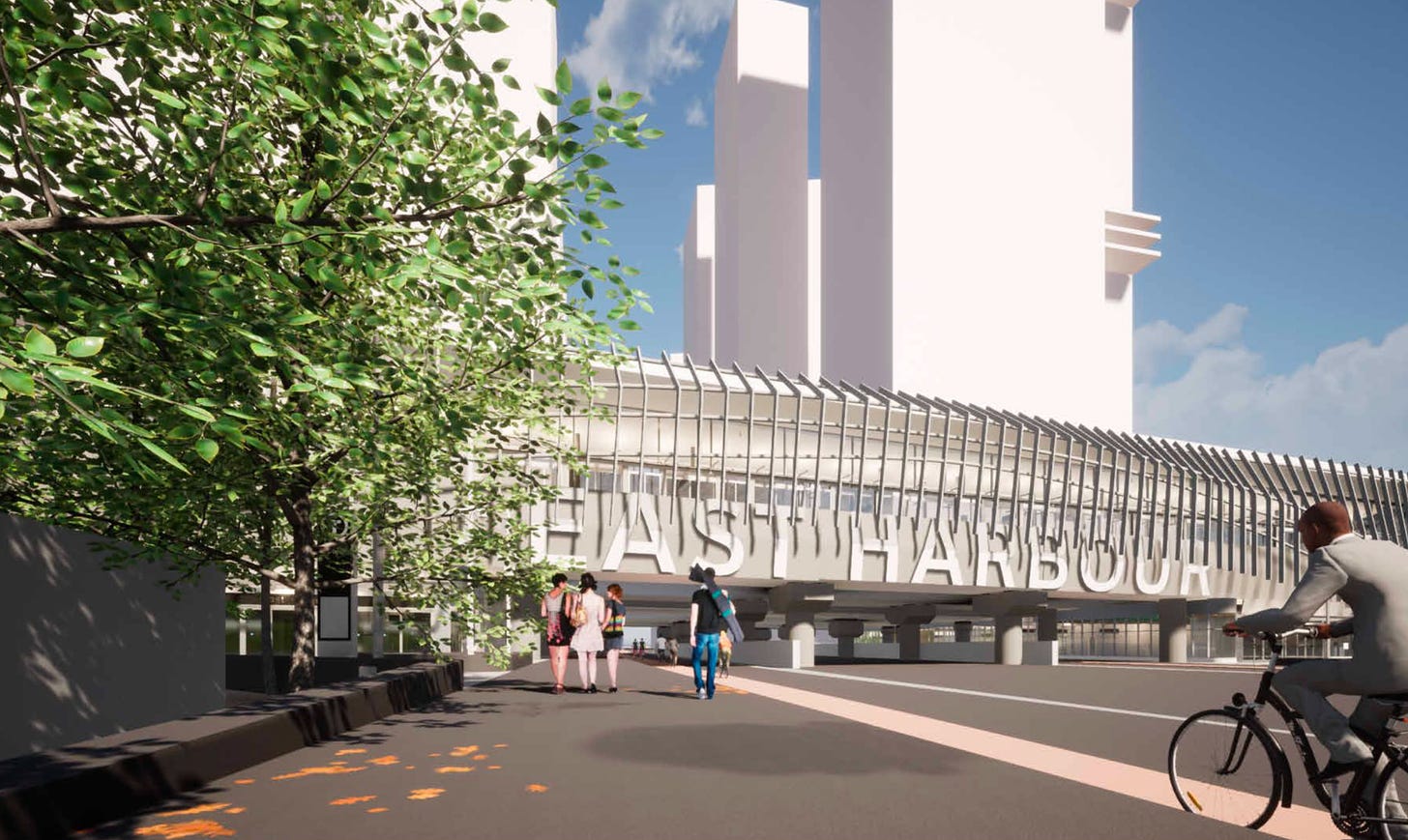
Since it shows up on the diagram, I’ll also point out that while Broadview is quite wide when passing under the station, it seems to be for good reason. There will only be two car lanes augmented by wide sidewalks and bike paths as well as room for a dedicated right-of-way streetcar and streetcar platforms at the south end! This would enable an extension of the streetcar tracks on Broadview to the south to provide connectivity to the development and station, as well as to the Port Lands!
Structure Design
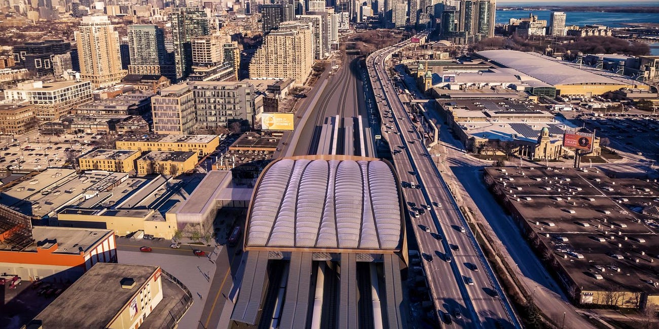
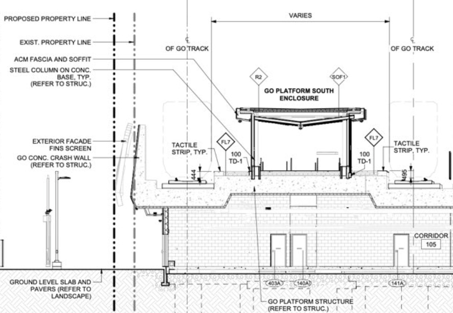
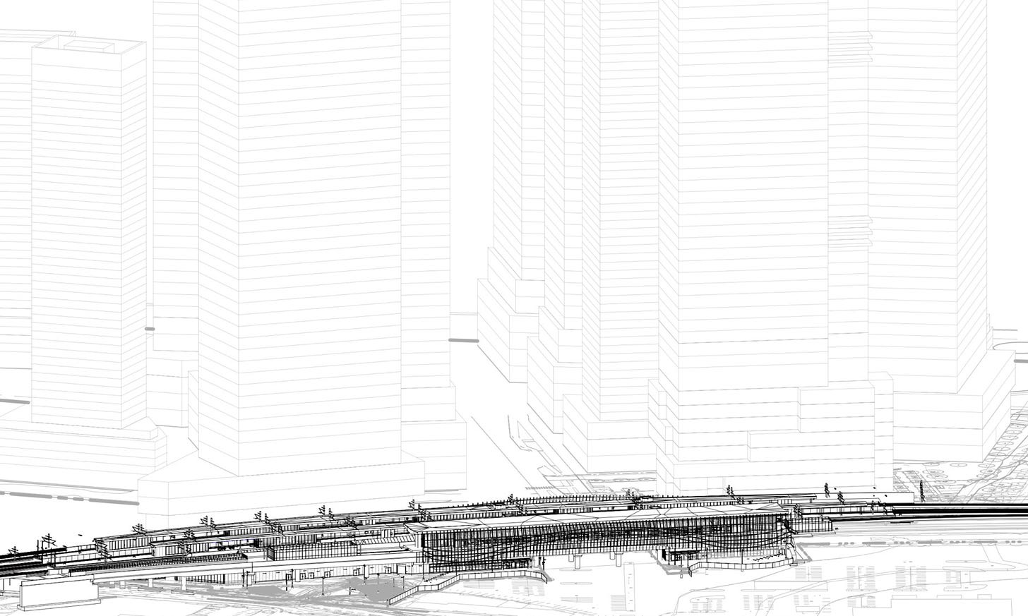
If you look back at the first photo in this post, you can get a good sense for the “structure” of the station, which consists of new GO platforms built on top of a giant concrete slab that also carries the tracks, and has an embedded angular crash wall with aesthetic “fins” on the south side (this seems pricey and is part of why I don’t feel this station is completely basic).
You’ll also clearly see that the Ontario Line platform is built on a totally structurally separate concrete structure, and what’s interesting is that it seems to be built elevated adjacent to the berm as opposed to being on a northern extension of said berm. That elevated section seems to continue to some extent in both directions.
You can also see a much larger mirror of the angular concrete wall on the south side of the station with its fins. And probably for the best, the Ontario Line station is completely closed (note the curtain wall above the screen doors), so if you were wondering if stations on this line would use mid-height or half height gates like some Istanbul Metro lines or the Sydney Metro, the answer is looking like no.
Stepping back, the station really is two structures, a nice GO station with a fully enclosed elevated metro station built directly adjacent to it and connected - albeit that connection is very good!
Details That Are Easy to Miss
On the brighter side, there are free public washrooms, including a universal washroom on both sides of the station which is awesome to see.
What’s even better is that there are even more access points to the GO platforms with stairs leading to the far eastern ends from Eastern Avenue. The number of entries and exits will not only be great for capacity, but it also (unusual for GO) makes use of the super long platform to provide additional connections, which could save passengers several hundred meters of walking!
Even nicer is that in the space between the two railways, the room left by the straight Ontario Line platforms was turned into a skylight for some natural light into the concourse area.
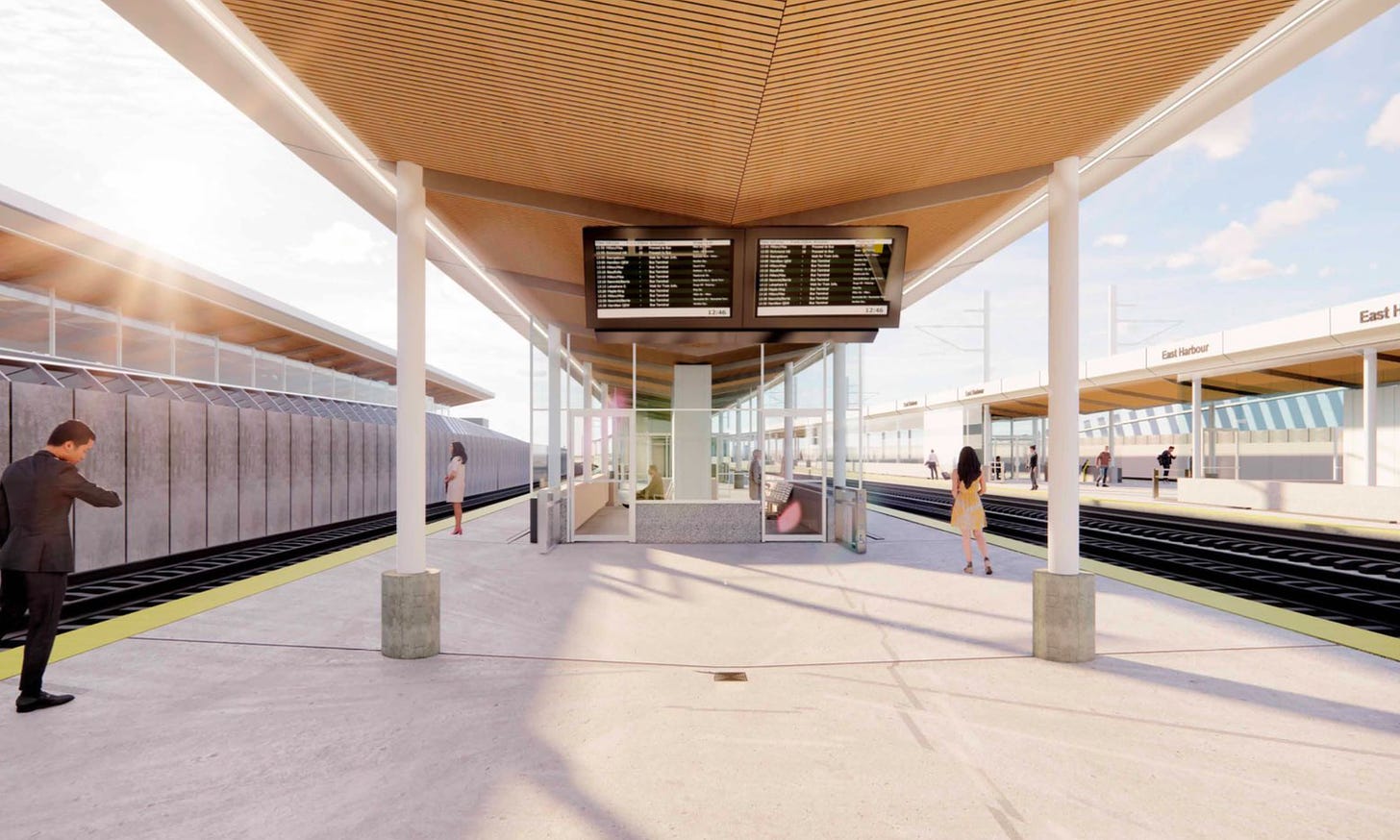
It also seems like someone got some inspiration from Berlin Ostkreuz, because East Harbour (which is definitely going to be confused with West Harbour in Hamilton) has its name written in giant text across the side.
The other nice touch you can see from pictures taken from platform level is that the design incorporates raised footings on the rather large on platform shelters and for the overhead canopy on the GO platforms. This has been a solid effort in future proofing by Metrolinx so that platforms can hopefully eventually be raised to allow level boarding at 610mm.
Impact
The first question worth addressing; is the station beautiful?
If you, like me, appreciate high-capacity public transit facilities, then maybe! The reality of East Harbour is that it is a simpler and less impressive structure than Exhibition, and the renderings that are included in this post also appear to be of a lower quality, so of course they are going to look worse! I think with nice material choices, the station could certainly look as good as a typical new Dutch or British train station — but we will have to wait and see.
The obvious thing I come back to is that it’s clear from Exhibition and East Harbour that Toronto’s third “interceptor” station where a subway line links up to a quad track GO trunk — Bloor station — probably is going to need a big expansion with its new connection to the subway. How that would work is interesting as the site is much more constrained than at East Harbour. If you’d be interested in seeing a potential design, let me know in the comments and I might do an article on that.
At the end of the day, East Harbour isn’t a perfect station, but it does seem pretty good — and it needs to be good with the enormous density planned around it.
The reality is, Toronto almost never manages to get transit built before development happens — and finally with East Harbour that’s actually happening!




Is there any evidence that the design could be improved in the future?
As I still think at the very least this station should have a full canopy if not when built then at least in the future.
What is the land around East Harbour like currently, and has any constructions started on the towers?